Over 100 industry awards, accolades, and achievements showcase our quality and commitment to client success.
Trusted by 500+ active clients.
Since reality is stranger than fiction, it won’t come as a shock to you when I tell you that customers never stick on your website for more than 60 seconds (the title was to grab your attention). According to research, it takes 50 milliseconds for a visitor to create an opinion about your website, whether they are willing to stay on your website, or they are eager to get away leave without any action.
Marketers of today know that the majority of people buy products from brands that incites an emotional response in them. The same principle stands true for making a buying decision on the website.
“Reason leads to conclusions. Emotion leads to action.” ~Donald Calne
The millisecond study mentioned above is perhaps not a bad thing at all. The consumers of today are busy and well-informed. They can sense the underlying intention in your website from a click away. Customers crave integrity, need fulfilment, transparency, an emotional connection and a simple solution that can cure their pain.
94% of the first impressions are design-related
A research conducted on health-related sites concluded that the information presented on the website influences the trust of the customer. The study showed that the look and feel of the website is the primary driver of the first impression.
The study found that the core design of the website is leaving a strong impression on the user than the content.
The customers were found complaining about the complexity of the design, the overly busy layout, boring web design, complicated navigation, too much text, and poor search capabilities.
Only 6% of the feedback complained about the content. Visual appeal is something that leaves a good or a meh first impression on the visitors.
A great design will get people to trust you and stick them around. The poor design creates skepticism and drives people away.
Table of Contents
Imagine you are walking down the road and you come across a cow. It’s just a cow so you’ll pass-by. But what if it is a Purple cow. You’ll not only stop; you’ll take a selfie with the cow and even and go Facebook Live.
After all, you don’t get to see a Purple cow every day. The same theory applies to your website. Every day thousands of sites make it to Google search results, and out of those, most of them feel the same.
To grab the attention of your customers, you must showcase something different. Something that no one else is displaying to the customer. Something like a Purple Cow in the middle of the road.
It is normal to give high-fives when the website is launched. In the midst of all this, the owner often forgets to ask the customer why they liked shopping from your site in the first place.
Brand identity is more than just the brand image. For an eCommerce website, brand identity is all about website navigation, presentation, security logo, and adopting the latest technology.
Think for a moment on this. If your website is not indistinguishable from other websites, why would people want to stick to your site at all?
A study found that if a website can inspire visitors on their first visit, the deal might end by them purchasing the product, even if it is sometime later.
If you can create a visually appealing stimulus it will force people to stay longer on the site which means, and there is a good chance that they will buy something from you or return to your website when need something.
When creating the first impression on the visitor, usability is something that will lead to credibility.
“We don’t sell lipsticks. We sell dreams.” ~Charles Revson
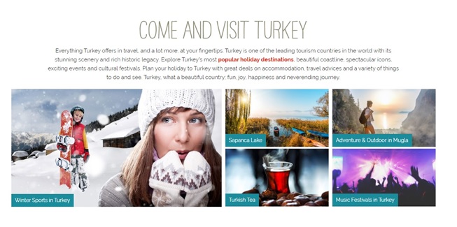
Are you able to sell the dream to your consumers? If someone is willing to travel to Turkey, why not showcase photos that will entice him to book a ticket right now.
Check the picture, the content, and even the usability of the website. Ensure that you give users more reasons to engage with the website. Whether it is by a picture, video, or even the content that can inspire the visitor to stay on your website.
A research shows that people don’t mind scrolling on a website.
When the visitors grace your website with their presence, you have an instant to create an impression. An inspiring above-the-fold will help users scroll down the website for more.
Heatmap studies show that people take navigation seriously.
If people think that the website is too complicated, they won’t waste time to understand the usability of the website. People get frustrated with unclear terms and conditions (hidden shipping costs, etc.)and even the complexity of the website. When the visitor hits a snag, there must be an option to get them out of there. Either by call or customer support chat, the user must feel comfortable to order from your website.
Mostly, it is just about the navigation of the website. The user expects a search bar that can lead them to their desired product. The first time customers often look for discount coupons or even time-sensitive promotions. Don’t make them wait too much for something they need.
You can use the product on sale, a rewards program or even free shipping to get hold of the attention of the customer.
How about increasing the size of the search bar, removing the trust symbol, and using a “Grand Sale” button instead. With an eCommerce website, there is always much room to experiment and see which of the things are working and which are not.
It is all about stealing the attention of the customer for the first few seconds, and from then onwards, it becomes easy to gain the trust of the customer.
The first impressions will leave the last lasting impact of the visitor. If you don’t work hard on creating a memorable first impression, there is a good chance that you will be forgotten in the digital cosmos just like every other website trying to get ahead of their competitors.
2602, 26th Floor, Mazaya
Business Avenue, BB2, Jumeirah Lakes Towers, Dubai, UAE
Copyright © Branex. All rights reserved