Startup Your Business in Dubai – UAE
December 8, 2016
How to Run a Successful Business in Dubai
How to Run a Successful Business in Dubai – UAE?
January 3, 2017

Top 8 Web Design Trends Your Startup Needs to Stand Out in 2017

web design trends for 2017

Trends are eminent changes that usually occur in every creative industry, and web design is no different. The web design industry is constantly changing and evolving because of innovation, experimentation and modification. A multitude of new trends and styles are the driving factors for change, which lead an industry towards the betterment.

In 2016, we have seen a lot of great website designs, and now it’s time to see what 2017 has in store for the web design industry. We have already started observing some web design trends that are sure to dominate websites in 2017.

Here, we will look at top 8 web design trends which will continue through 2017 to help business owners attract more visitors to their website and achieve their conversion goals in 2017.

1. Minimalism Still Rules


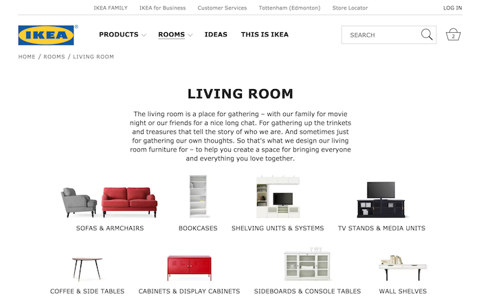
This trend condenses many other web design trends. Minimalist web design trend with the focus on performance, speed and uncluttered elements can give the subtle flow to websites. This trend was initiated by the shift to responsive websites, which not only looks clean, but also encourages scrolling, i.e. user doesn’t expect all the information to be cluttered above the fold. Typography, contrast, white space all are important in minimal website designs.

2. Animations and GIFs will be used more heavily


In 2017, there will be increased use of GIFs and animations in websites as they are a great way to show the meaningful content in the best visual way possible. GIFs and animations with SVG and CSS are now becoming the most sophisticated way to add some uniqueness and design elements to your website design.

The use of animations in near future will become more dominant, because of more focus on content share and animation helps convey the message easier and quicker than any other format like video and text. In addition, if used properly, it can be more lightweight than different images and videos.  

3. Less Navigation Options


In 2016, many websites redesigned with less navigation options. This trend will likely become strengthen in 2017. The main header menu that is used to present 5 to 7 options will become reduce to only 3 or 4. Fewer choices help users to find out what they are actually looking for without moving here and there.

One of the major reasons of adopting this trend is accessing the web through smartphones rather than computers. The practice of making things easier to navigate has taken over and altered the menu and navigation options on websites. Due to this transformation, more and more websites are starting to simplify their menu options to only three or five options. Removing an overly complicated navigation and keeping it minimal help visitors to focus on the purpose at hand, rather than trying to find a way off the page.

4. Microinteractions will change the way


Microinteractions are a refined, yet authoritative ways to interact with a website. They are often present in hovers, click animations, scrolling effects and more. Since these types of design elements will always there, web designers are spending more time on improving these elements and making them more informative, creative and subtle. One of the most used integrations is the rollover or hover, allowing visitor to simply move the cursor over different parts of the site to check these microinteractions and interact with the website.  


5. More Focus on Content-Based Websites


Web designers have spent years for introducing different elements to business websites such as banners, headers, ads, CTAs, popups, social media buttons, signup forms etc. All of these efforts have simply ended up nothing but cluttering the website and taking up more white space, plus taking the attention of users away from the main purpose – content.

In 2017 and near future, website designs are likely to start getting back to the basics and emphasizing more on content. It means all distractions and unnecessary elements will be removed by taking up less space for such elements. Moving back to the important piece of website that is content will be dominant in 2017.

6. The Use of Handwritten Elements


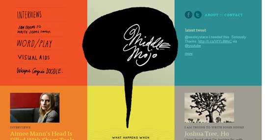
The increased use of handwritten typography will be a unique web design trend for 2017. These elements include fonts, icons, graphics, buttons and certain other elements that bring a unique yet creative touch to your website. Introducing the hand drawn elements will be a nice change for web design industry, giving more options for CTAs and providing great contrast to clean and uniform typography.

7. Flat Designs will no longer exist


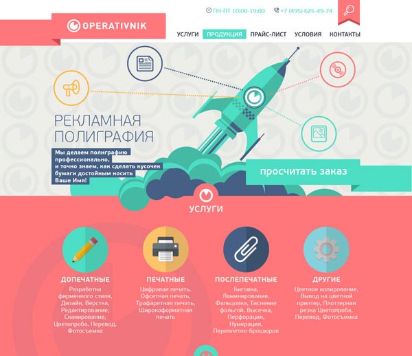
The design industry has reached the point in flat trends where every design has started to look the same, therefore all the professional web designers continue to slowly shift away from flat web designs. Designers feel that their creativity is gone and the flat design ending is the solution to be imaginative and unique. Now web designers are continuing to create visually appealing and bold styles which are effective in depicting a brand while maintaining and improving the ease of use and functionality for the users.

8. Rise in Landing Pages


As web design industry is focusing on more content based websites and sharing them more, in 2017, we will likely observe more emphasis on landing pages instead of a home page design. Though every website has a homepage, but as content marketing spreads, web marketers will want to get traffic to dedicated landing pages to attract their target audience and their specific needs.

The basic idea of content marketing is to increase awareness and conversions among audience, so you can increase conversions on your website by simply landing visitors on a page. Landing pages will be designed for the target market to get more conversions.

Wrapping it up

So, these are the 8 website design trends that users can expect in 2017 and beyond. By considering the needs of your target audience, you can choose the right design trend for your startup website that will help you attract your intended users and better meet the conversion goals of your business.


Saher Naseem
Saher Naseem
Saher Naseem @SaherNaseemD is a creative writer, blogger and a social media addict. Blog writing is her passion and she shares her knowledge and insights on the latest advancements and trends in web design, web development, social media marketing, SEO, app development and much more.

2 Comments

  1. Sean Rice says:

    Great article.
    I agree with you on all points except one. You’ve noticed a lot of trends that I think you’re right about. Generally, focusing on the little things (micro-interactions and animation), and creating simplicity will help savvy businesses succeed.

    I think you might be a bit off-target in saying “Flat designs will no longer exist.” While you’re seeing the fad peaking an beginning to fall off, I don’t think they’ll go away. Much like skeuomorphism is still around (flat design, while a response to rampant skeuomorphism, did not eliminate it entirely), though not to the extent that it was, “flat” as a design technique will still exist in a designer’s toolbelt to be used as the situation requires.

    I look forward to what’s next! Thanks for sharing your mind!

    • Saher Naseem says:

      Hey Sean, thanks a lot for your valued comment. I do agree that the flat design technique will not completely vanish from the scene. However, I feel that entire website’s UIs will not be “completely” flat as the example I shared above. Dashboards/consoles might remain flat as it serves a completely different purpose and an aesthetically pleasing interface is not required here.

      Would love to read more of your valuable insights in future as well. Cheers!

Leave a Reply

Your email address will not be published. Required fields are marked *